I wanted to thank Michele for bringing MyDeco to my attention. It's a very cool site with lots of goodies for all of us design enthusiasts out there. There are fun quizes, lots of eye candy, and you can make a moodboard! I also want to check out the 3D room planner they have. Here are the results of my style quiz:
I am a "homecoming queen." This makes me laugh, because I didn't even go to my prom let alone homecoming, and I'm definitely not the "princess" type. ...atleast I don't think I am....
"Nothing - budgets included - stops you from putting your all into creating a dream home. Your look is quintessentially feminine: cool, pretty colours; layered patterns and textures; and flawless attention to every detail."
Sadly, my budget definitely puts my dream home on hold...
My bedroom supposedly is, "Your bedroom benefits from a lovely feminine touch. Sleep is fundamentally important to our well being. In busy towns and cities, noise can often hamper a good night's sleep. Soft furnishings really do absorb sound, and touch is such an important sense in the bedroom, from crisp, linen sheets to wool or even sheepskin underfoot. You like to surround yourself with pretty frills and flounces in your bedroom, using a palette of beautifully muted colours to create the perfect retreat from daily stresses and strains."
This is pretty accurate! You can see my bedroom here (a few things have been changed since this post, but you get the gist).
My moodboard - I love white interiors. But recently, I've also been into richly colored accent pieces and upholsteries in luxurious fabrics. I also learned a bit about myself in the process - I like mirrored case goods!
Visit my profile here.
If you take the quiz - let me know what style you get - I'm interested to see what everyone is!
via MyDeco
I'm back, and I come bearing the portfolio of one of my favorite photographers!
Francesco Lagnese's work takes my breath away. The atmosphere is unreal and the light is so clear. I can't explain it - you have to see for yourself!
Not too shabby a spot to take brunch...and lunch and dinner
*stunning!*
All photos property of Francesco Lagnese
Not too shabby a spot to take brunch...and lunch and dinner
*stunning!*
All photos property of Francesco Lagnese
Labels:
console,
dining,
entryway,
Fancesco Lagnese,
flowers,
gardening shed,
photography,
portfolio,
travel,
tropical,
vacation,
white interiors
The Macassar Chaise Lounge by Andrew Muggleton
Andrew Muggleton furniture and design offers a cross over of metal wood and fabric.
The Macassar Chaise Lounge is typical of Andrew Muggleton with it sleak line and contemporary modern design.
The mix of Ebony Steal and leather create a feature item for a living, study, office or even a large bedroom.
Comfort and style.
Click the following to find out more about the Macassar Chaise Lounge
Furnitude I Love: Paul Duffy Edition
Intrigued by what I saw on his website, I asked Paul Duffy, from Sómhar Furniture Design in Ireland, what he meant when he described his furniture, which is beautiful and even novel in its use of surface texture, as being "uniquely Irish." Paul responded that "apart from the unique Irish landscape which provides both inspiration and clarity of thought, the Irish have a great way of getting the best out of what's available."
That's a great segue into his efforts at being more responsible with the materials he uses for his furniture. He sources Irish hardwoods locally whenever possible and plans his milling carefully to get the best possible yield from the lumber. I like his view of the larger ecological picture and respect the range of his efforts, from reducing travel to meet clients by using the Internet in the design process to using scrap wood in the energy-efficient burner that heats his home. I also had to know about the word "Sómhar" from the monicker of his enterprise, which he said translates into "comfortable and luxurious." As you'll see, that is a fitting description for his work. Check out these chairs with their clean, fluid backs and the wedged through-tenon construction. I love the texture on the seat.
He uses a similar texturing technique in this beautiful hall table.
Finally, I love his Driftwood Table with inlaid curves mimicking the Irish coastline and the flow of water.
Visit Paul's website at www.somhar.com to see more of his work and read about his philosophy of making furniture.
I'll be back soon! I'm going to visit a place like this...
I'm off to Florida you guys! I'm taking a much needed long weekend to visit one of my sisters and relax on the beach. So, I'm leaving you with ways to add some light-hearted, tropical air to your space.
oh...this is so me... natural wood tones and white
via the beautiful blog, this is glamorous
West Elm(top)/Pottery Barn ( 2 bottom) via Material Girls
Material Girls gave some really good advice on achieving this look:
via Home Decorating Reviews
Tropical island architectural genius! I love the use of stone! It must make the home feel so cool when coming in from the beach.
viazlgdesign
oh...this is so me... natural wood tones and white
via the beautiful blog, this is glamorous
West Elm(top)/Pottery Barn ( 2 bottom) via Material Girls
Material Girls gave some really good advice on achieving this look:
- Rattan or wicker furniture
- Wood flooring
- Natural area rug- seagrass or sisal
- Mixing lots of texture and pattern is a must!
- Comfort is key- large upholstered furniture in preferably white or off white will give it a fresh, clean, and crisp look
- Animal prints!!!!
- A few leather pieces
- Try to stick with these colors- pale yellows, browns, golds, beiges, natural greens that have more yellow in them, soothing blues, whites, and splashes of red, black, and chocolate brown
- Wood furniture
- Lanterns
- Bamboo shades for your windows
- Table setting- they have these great round textured placemats at Crate and Barrel/ C&B Outlet or you could do wooden bowls
- Large floor vase with bamboo sticks
- A candle in a glass container with water rocks/stones
- Wood bowl with real fruit
But if you want more of a beach/nautical look, here are some of my favorite accessories:
- Faux coral- I can't say enough about it, I have a piece of it in my Living Room that I bought at Crate and Barrell and it just makes my coffee table.
- Extra large clam shells- I know we have done a high low feature on this before, but you can find them everywhere these days- they are very in style!
- Anything dark blue and white
- Stripes are always nice for this
- How about putting starfish in a bowl or in a jar?
- Shells on a stand or in a glass bowl
- A glass apothecary jar filled with sand...my mom (who inspires me every day!) has been collecting sand from the different beaches she has visisted while on vacation for the past I don't know how many years- she then puts the sand in different glass jars and labels them where they came from. It makes a really cute display and a great conversation starter about all of your travels!
via Home Decorating Reviews
Tropical island architectural genius! I love the use of stone! It must make the home feel so cool when coming in from the beach.
viazlgdesign
Labels:
"West Elm",
airy,
beach,
coastal decor,
Florida,
nautical decor,
Pottery Barn,
stone,
tropical
Peaceful, calming shots from a renowned interior photographer
Let the work of Annie Schlechter help you get over hump day. She sure did help me. This week is stressful because I'm leaving tomorrow for Florida and have a lot to get out the door before I leave. Her pictures help me try and imagine a simpler, less-fuss life. Ohh..one day maybe. Which photo helps you stress less?
I'm not a good cook at all, but I like the ritual of cooking in the evening. It forces you to slow down a little.
You probably recognize this photo from the late Domino.
An artist's dream! A studio not left wanting...
Ah...a perfectly organized closet
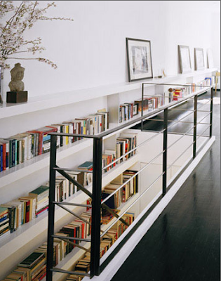
A well stocked home library is my idea of heaven
Okay, so is this house...I will have dreams about this house.
This is the photo that first caught my attention. What a beautiful blue. It immediately made me think of my beloved blue merle aussie, Cody. :(
all images property of Annie Schlechter
Labels:
Annie Schlechter,
beach house,
closet,
Cody,
Domino,
donate,
interior photographer,
library,
Modern,
portfolio,
studio,
white interiors
Subscribe to:
Posts (Atom)